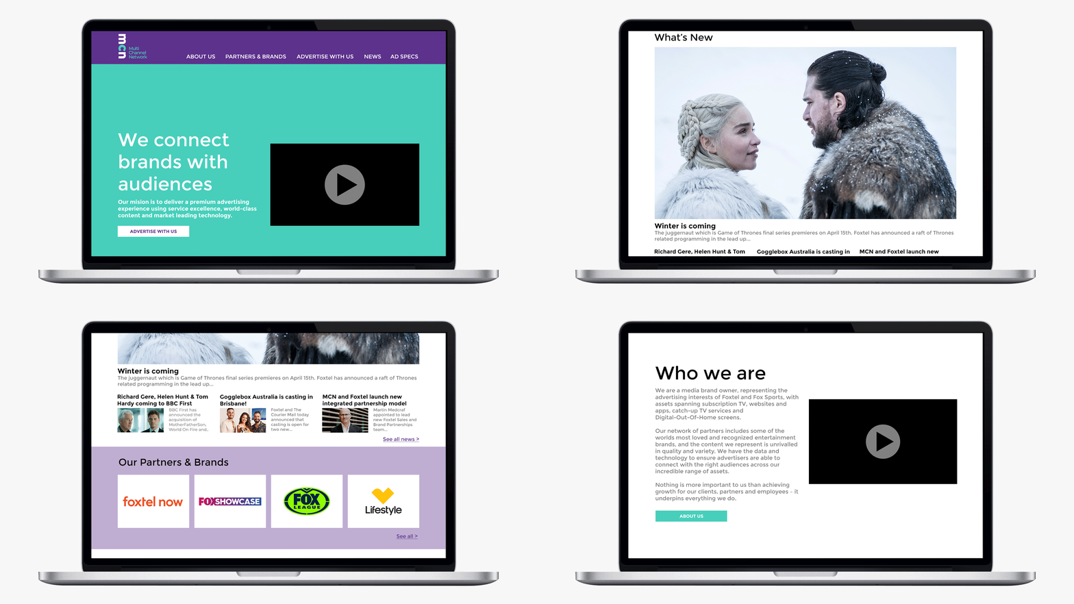
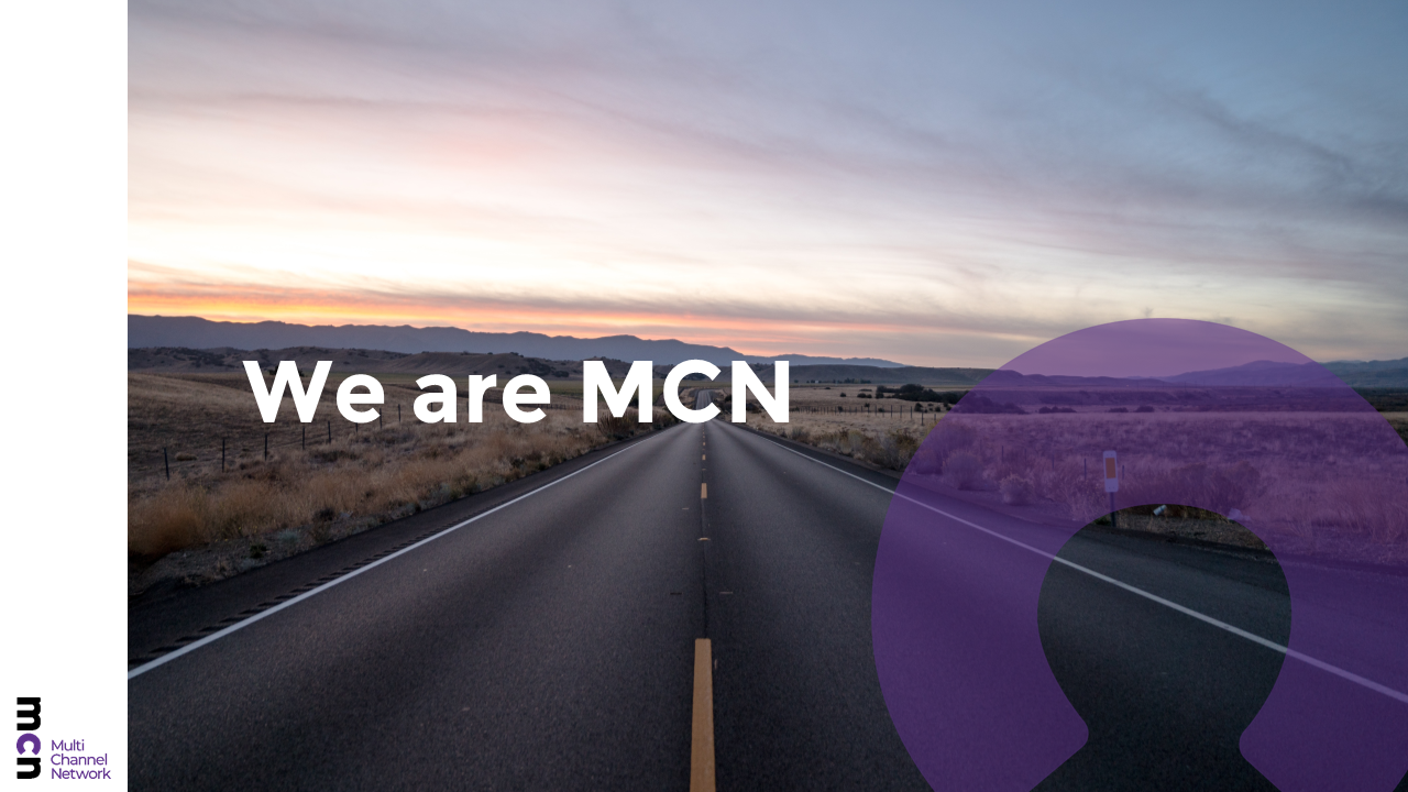
With a change in leadership and business proposition, I led MCN through a re-brand to re-position the business in market. From a previously heavily corporate identity, and with the guidance of our strategic creative agency, JOY, we re-energised the brand to be more bold, young and fresh, literally turning the MCN brand on it's head. The logo is layered with symbolism of a "head" hidden in the C - a device that would carry through all designs reflecting MCN's new people-centric approach and our commitment to our employees, channels, audiences and clients. The re-brand was applied across several digital and print touch points and implementation included an extensive PowerPoint template to be used by staff. To support the deployment of the new brand we ran training sessions on using the new template and staff incentives to encourage correct uptake of the new branding.


